JUNE 15, 2026
Quotes
GET QUOTE
Enter Symbol:
Finance Center
|
MarketWatch
CALCULATOR
Shortcuts
LINKS
Finance Center
News Center
Weather
Help
INDUSTRIES
Lawyer Express
Journalist Express
MD Express
CLO Express
Login
LOGIN
Username:
Password:
Remember Login
Login Problems?
Forgot Your Password?
The Executive's Internet
Mon, June 15th
US NATIONAL NEWS |
disclaimer
|
more news
Yahoo News:
Iran Signals No Deal Will Be Signed by Trump's Sunday Timeline
Google
Amazon
Wikipedia
INTERNATIONAL NEWS |
disclaimer
|
more news
BBC Front Page:
Bowen: Iran deal ends Trump's war that revealed limit of US dominance
TECHNOLOGY NEWS |
disclaimer
|
more news
Mac Rumors:
Apple Seeds Second iOS 26.6 and iPadOS 26.6 Betas to Developers
Home
News
Search
Industries
CEO@Home
Execudiva
Shop
INDUSTRIES
CEO@HOME
EXECUDIVA
SHOP
TECHNOLOGY NEWS
Setup News Ticker
My Headlines
Top News
Business News
National News
Technology News
Political News
International News
Sports News
Arts & Entertainment
Business News
National News
Technology News
Political News
International News
Sports News
Arts & Entertainment
Top News (Technology News)
CNET How To
CNET Most Popular Products
CNET News
CNET Reviews
CNN Technology
Computer World Security News
ComputerWorld
ConnectSafely
Engadget
eWeek
Fox Technology news
GigaOM
Gizmag Emerging Tech
Gizmodo
KM World Articles
Mac Rumors
Major Geeks
Major Geeks
Network World Security
New York Times Tech
NPR Topics: Research News
PC Magazine Reviews
PC World Latest News
ResearchBuzz
Reuters Technology
SlashDot
TechCrunch
TechNewsWorld
Time: Techland
Washington Post Tech
Wired News
WSJ Technology
Yahoo Technology
TECHNOLOGY NEWS
Searching for 'Here Almost'. (
Return
)
Mac Rumors
Jun 15, 2026
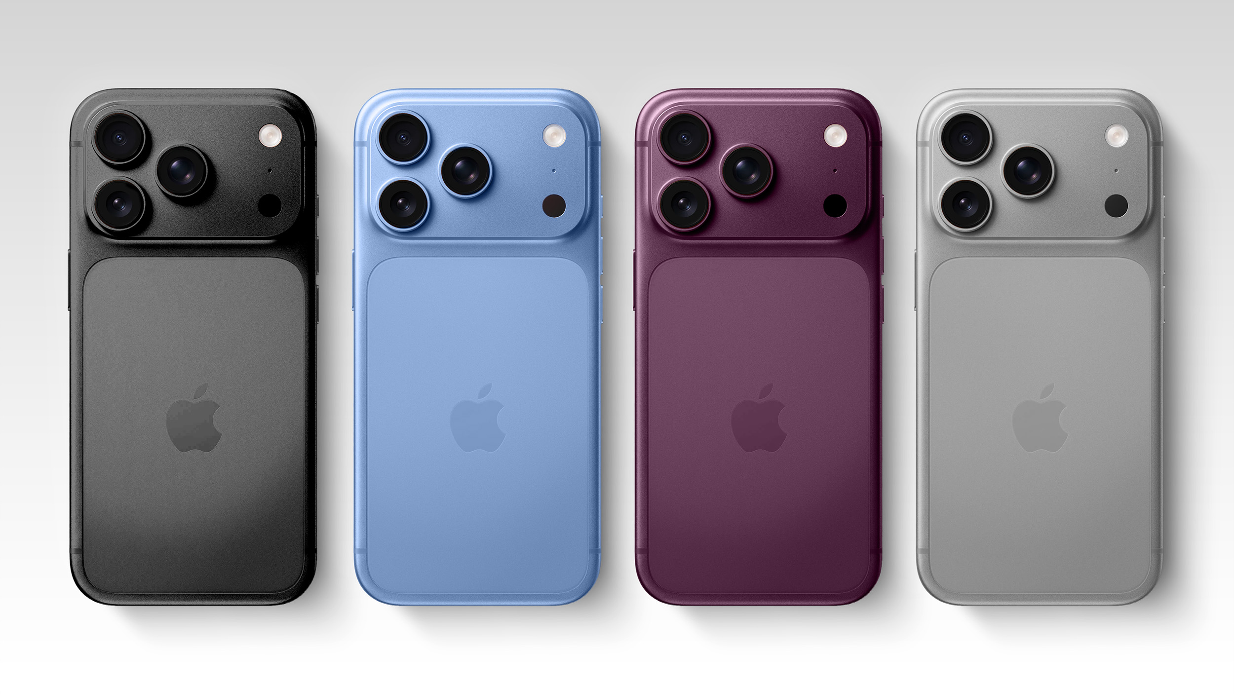
Leaker Warns iPhone 18 Pro New Colors May Face Same Durability Issues
A known Weibo leaker has reiterated that the iPhone 18 Pro will retain its aluminum alloy build, while issuing a specific warning that the new color options may be susceptible to paint peeling.
CNET News
Jun 15, 2026
Prime Day Is Almost Here. Get the Best Deals Handpicked and Sent Straight to Your Phone
If you're getting overwhelmed with all the deals out there, we're giving you the shortcut to the best sales.
TRENDING TAGS
Apple
iOS
iPhone
How
Coming
Older
World
Cup
Live
vs
Stream
FIFA
Cup
World
Live
vs
Stream
FIFA
Here
World
Cup
Almost
how
Rooting
iOS
Coming
Apple
Run
Three
Features
Media
Social
Ban
UK
Sweeping
Under-16s
Live
World
Cup
vs
Stream
FIFA
These
Could
SpaceX
Stocks
Simple
Charging
Social
Media
Ban
UK
Sweeping
Under-16s
Phone
iPhone
Apple
Run
iOS
AI
NEWS SOURCES
Top News (Technology News)
CNET How To
CNET Most Popular Products
CNET News
CNET Reviews
CNN Technology
Computer World Security News
ComputerWorld
ConnectSafely
Engadget
eWeek
Fox Technology news
GigaOM
Gizmag Emerging Tech
Gizmodo
KM World Articles
Mac Rumors
Major Geeks
Major Geeks
Network World Security
New York Times Tech
NPR Topics: Research News
PC Magazine Reviews
PC World Latest News
ResearchBuzz
Reuters Technology
SlashDot
TechCrunch
TechNewsWorld
Time: Techland
Washington Post Tech
Wired News
WSJ Technology
Yahoo Technology
NEWS CENTER OPTIONS
Manage Folders
Manage Ticker/Headlines
Choose from News Feed Directory
Add Your Own Feed
Create Feed Using Search Terms
ADD/CREATE FEEDS
Choose from News Feed Directory
Add Your Own Feed
Create Feed Using Search Terms